INDUSTRY:
PRODUCTION AND DIGITAL DESIGN
CREDITS:
ART DIRECTOR MICHAEL BOUND | DESIGNER BRUNO LOVERBECK
EXPERIENCE:
UX UI DESIGN

Palmilla Beach
INDUSTRY:
INDUSTRY:
PRODUCTION AND DIGITAL DESIGN
PRODUCTION AND DIGITAL DESIGN
CREDITS:
CREDITS:
Art Director
Katy Backham | Design Lead
Linda Truong
Copywriter
James Cooke | Designer
Bruno Loverbeck
ART DIRECTOR MICHAEL BOUND
DESIGNER BRUNO LOVERBECK
ART DIRECTOR MICHAEL BOUND
DESIGNER BRUNO LOVERBECK
EXPERIENCE:
EXPERIENCE:
DIGITAL DESIGNER
UX UI DESIGN
UX UI DESIGN
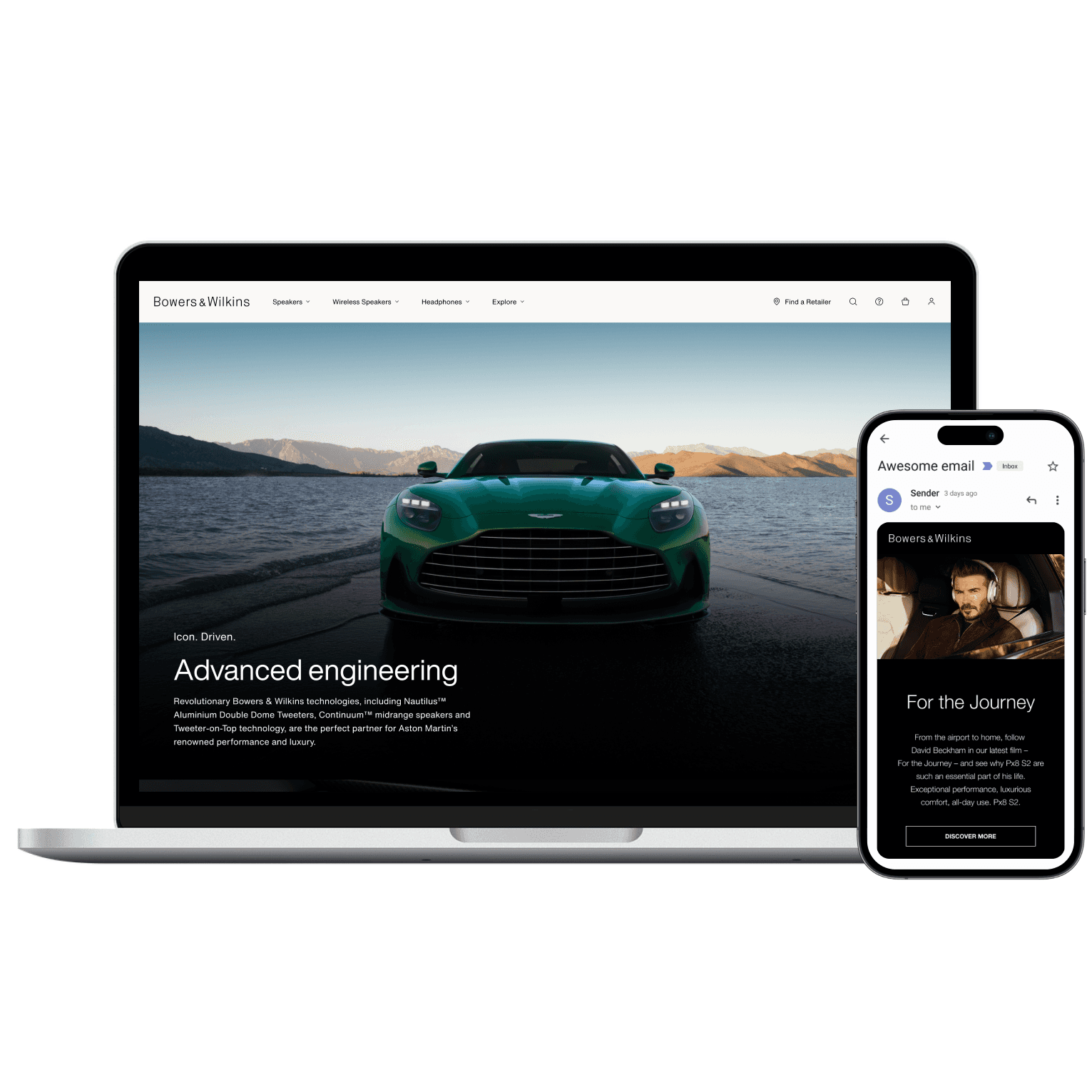
Bowers & Wilkins
Palmilla Beach
Palmilla Beach
about.
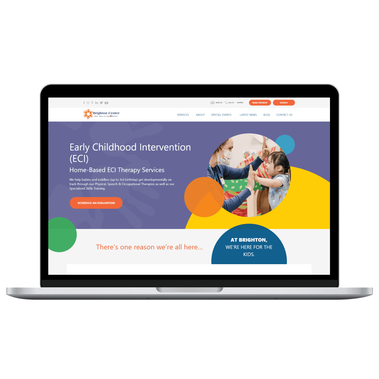
Palmilla Beach is a coastal resort community located in Port Aransas, Texas, offering a mix of real estate opportunities, vacation rentals, and premium amenities such as golf, dining, and beachside services.
This project focused on redesigning the brand’s website, transforming a fragmented content structure into a user-centered experience that supports both property sales and hospitality services.
context & challenge.
The client approached us with document containing all required content, references, and business expectations.
At the same time:
The original website was completely offline
The brand had just undergone a full content and brand audit
There was no access to previous UX patterns, analytics, or user data
This created a high-risk scenario:
No baseline to iterate from
Large volume of content with no hierarchy
Multiple business goals competing for attention (real estate vs hospitality)
On top of that, the project was time-sensitive, as the website was the brand’s primary communication and sales channel.

objectives.
USER GOALS
Quickly understand what Palmilla Beach offers
Explore real estate opportunities with clarity
Easily book stays and access amenities
Navigate a content-heavy ecosystem without friction
BUSINESS GOALS
Re-establish digital presence ASAP
Drive real estate conversions
Increase vacation bookings
Showcase brand value and premium positioning
DESIGN GOALS
Create a clear and scalable information architecture
Balance multiple entry points (Real Estate vs Stay vs Amenities)
Deliver a visual-first, content-light experience aligned with luxury resorts
Ensure usability despite high content density
USER GOALS
Quickly find relevant services
Understand complex information
Access content across devices
Feel supported and confident
BUSINESS GOALS
Improve service accessibility
Increase engagement with resources
Strengthen trust with families and partners
DESIGN GOALS
Reduce cognitive load
Improve information hierarchy
Ensure accessibility compliance (WCAG 2.1)
Create a scalable and consistent system
discovery phase.
RESEARCH & DISCOVERY
Since the original website was unavailable, competitive benchmarking became critical.
We analyzed similar coastal resort communities, including:
Alys Beach
Cinnamon Shore
Hilton resort experiences (for content structuring patterns)
Local Port Aransas competitors
During this research, we focused on observing:
Industry-standard navigation patterns
Content grouping strategies (Amenities, Real Estate, Experiences)
Conversion flows (booking, property browsing)
How luxury resorts balance aspirational storytelling vs usability
Our key insight:
High-end resort websites rely heavily on emotional storytelling and minimal copy, but still require strong structural clarity underneath.
USER UNDERSTANDING
Without direct user data, we inferred primary user segments:
Prospective Buyers → looking for long-term investment / second homes
Vacation Guests → short-term booking and experience-driven
Returning Visitors → need quick access to services and amenities
Behavioral assumptions:
Users are goal-oriented but visually driven
Expect fast access to key actions (book, explore, contact)
Low tolerance for confusion due to premium expectations
define phase.
INFORMATION ARCHITECTURE
The final sitemap was structured into clear top-level categories with deeper segmentation inside each section to reduce cognitive load.
A secondary navigation (hamburger menu) consolidated all planned pages.
Strategic decision:
Separate exploration (top nav) from complete access (hamburger menu) to maintain clarity without sacrificing depth.
INFORMATION ARCHITECTURE
The final sitemap was structured into clear top-level categories:
With deeper segmentation inside each section to reduce cognitive load.
A secondary navigation (hamburger menu) consolidated all planned pages.
Strategic decision:
Separate exploration (top nav) from complete access (hamburger menu) to maintain clarity without sacrificing depth.


USER FLOW
For the user flows, the focus was to reduce friction between discovery and action.
The website combines high content density with multiple user intents, which increases the risk of confusion, drop-off, and low conversion.
To mitigate this, we designed streamlined flows that align with distinct user goals, ensuring a clear path from exploration to conversion.
USER FLOW
For the user flows, the focus was to reduce friction between discovery and action.
The platform combines high content density with multiple user intents, which increases the risk of confusion, drop-off, and low conversion.
To mitigate this, we designed streamlined flows that align with distinct user goals, ensuring a clear path from exploration to conversion.


ideate phase.
SKETCHING DESIGN IDEAS
Initial sketches focused on:
Structuring large content blocks into digestible sections
Prioritizing visual hierarchy over text
Designing modular layouts that could scale across multiple pages
We explored different approaches to:
Navigation positioning
Content density vs whitespace
Image-to-text balance

ui phase.
LOW-FIDELITY UI
Low-fidelity designs were used to define the structural foundation of the product, focusing on:
Information hierarchy
Layout composition
Content prioritization
At this stage, the goal was to validate how large amounts of content could be organized into clear and digestible sections while supporting multiple user intents.
Scroll! ↓↓↓


HIGH-FIDELITY UI
High-fidelity designs translated the validated structure into a polished visual experience aligned with the brand’s premium positioning.
This included:
Typography and visual hierarchy
Image-driven layouts
Consistent spacing and alignment systems
Given the project’s time constraints, a component-based approach was applied to ensure scalability and consistency across all pages.
Scroll! ↓↓↓
HIGH-FIDELITY UI
High-fidelity designs translated the validated structure into a polished visual experience aligned with the brand’s premium positioning.
This included:
Typography and visual hierarchy
Image-driven layouts
Consistent spacing and alignment systems
Given the project’s time constraints, a component-based approach was applied to ensure scalability and consistency across all pages.
Scroll! ↓↓↓


prototype phase.
VALIDATING INTERCONNECTED PAGES
The prototype focused on validating:
Navigation clarity
Flow between key sections
Content readability and hierarchy
Special attention was given to:
Smooth transitions between high-level categories
Clear call-to-actions across the experience
Maintaining a balance between exploration and conversion

testimonial.
Bruno did a great job with the design comps for a large scale website. His attention to detail and willingness to put in the necessary time to make our deadline were excellent. He has great communication skills and our team found it easy to coordinate and work with him.
Bruno did a great job with the design comps for a large scale website. His attention to detail and willingness to put in the necessary time to make our deadline were excellent. He has great communication skills and our team found it easy to coordinate and work with him.
Bruno did a great job with the design comps for a large scale website. His attention to detail and willingness to put in the necessary time to make our deadline were excellent. He has great communication skills and our team found it easy to coordinate and work with him.
Michael Bound
Feedback via UpWork