INDUSTRY:
PRODUCTION AND DIGITAL DESIGN
CREDITS:
ART DIRECTOR MICHAEL BOUND | DESIGNER BRUNO LOVERBECK
EXPERIENCE:
UX UI DESIGN

Brighton Center
INDUSTRY:
INDUSTRY:
PRODUCTION AND DIGITAL DESIGN
PRODUCTION AND DIGITAL DESIGN
CREDITS:
CREDITS:
Art Director
Katy Backham | Design Lead
Linda Truong
Copywriter
James Cooke | Designer
Bruno Loverbeck
ART DIRECTOR MICHAEL BOUND
DESIGNER BRUNO LOVERBECK
ART DIRECTOR MICHAEL BOUND
DESIGNER BRUNO LOVERBECK
EXPERIENCE:
EXPERIENCE:
DIGITAL DESIGNER
UX UI DESIGN
UX UI DESIGN

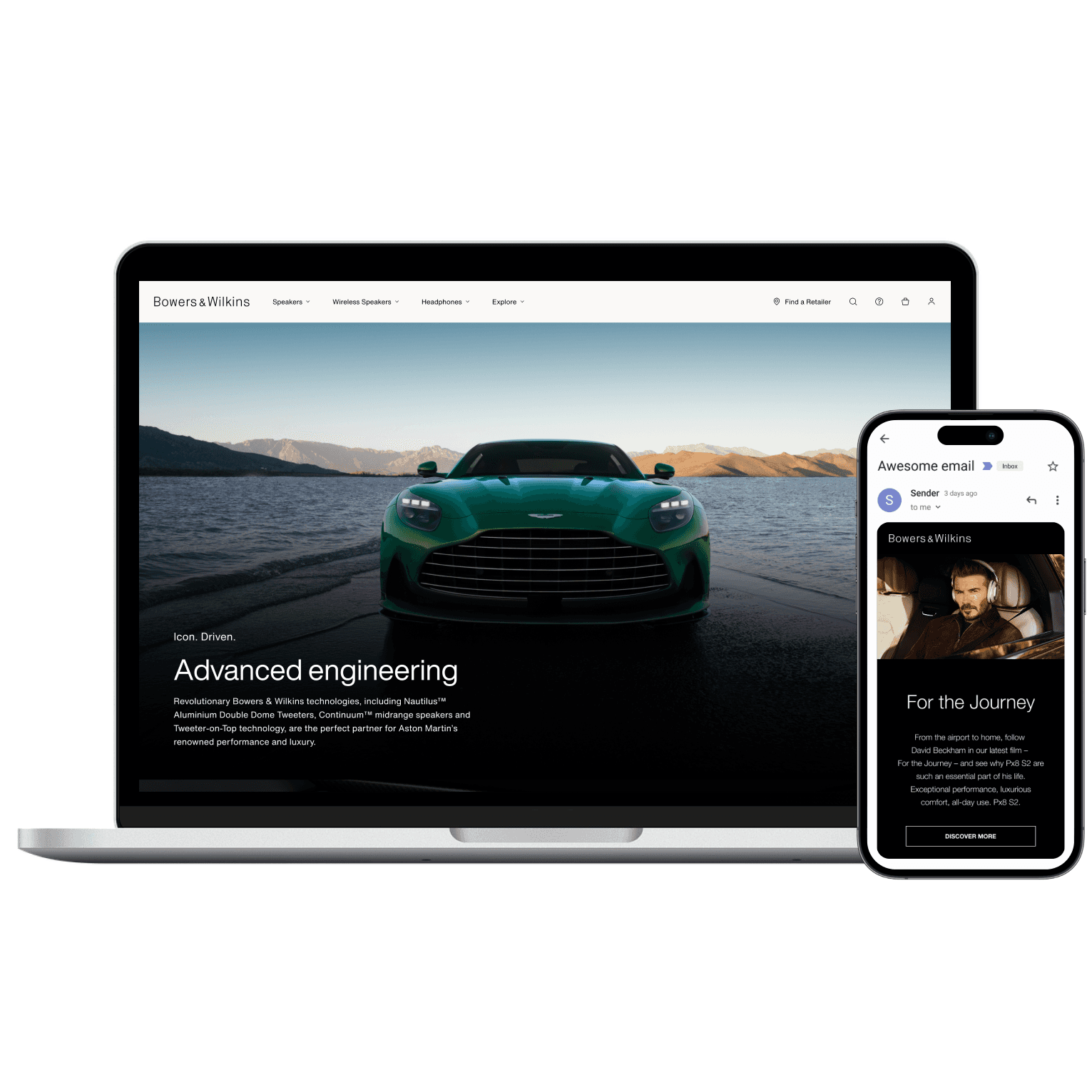
Bowers & Wilkins
Brighton
Center
Brighton Center
about.
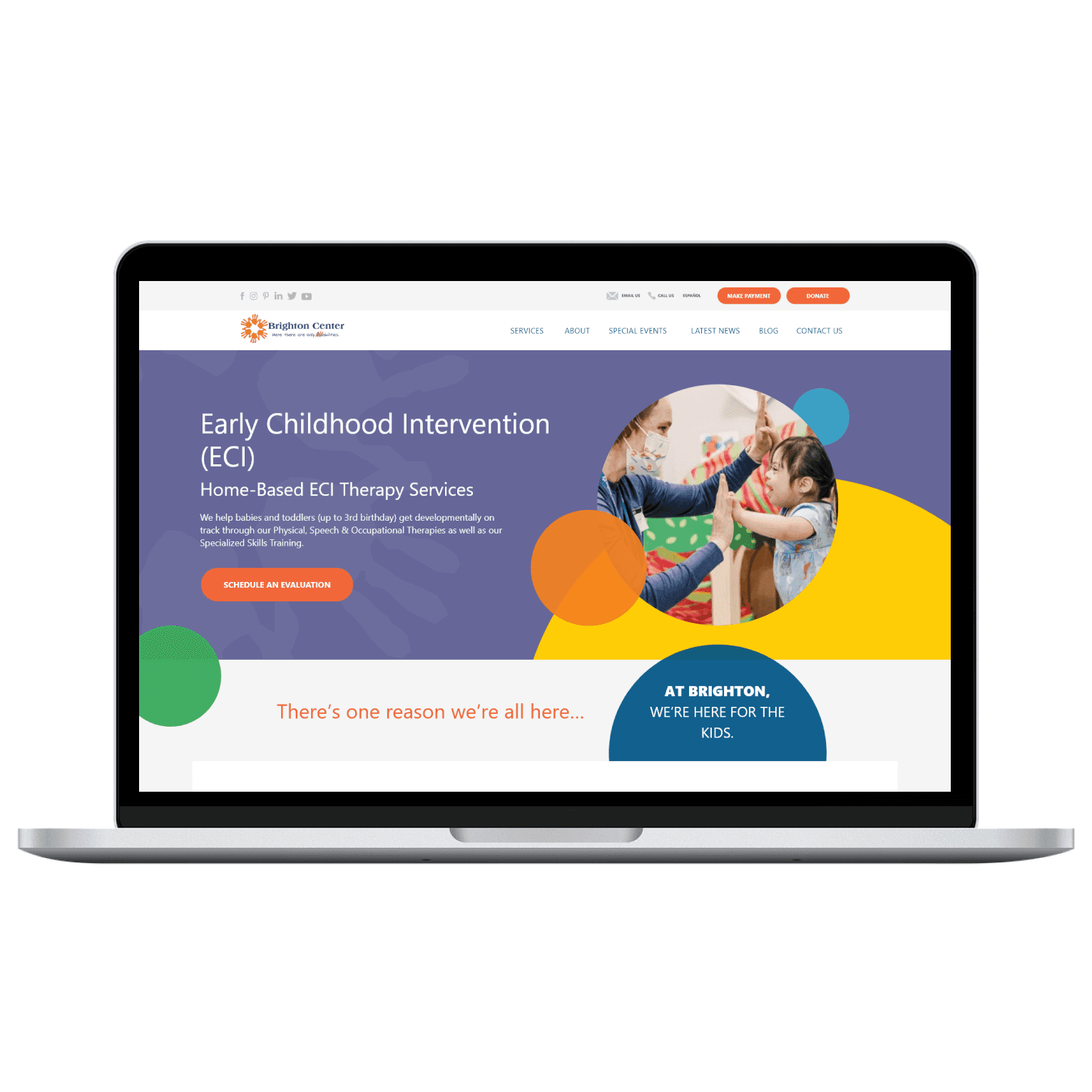
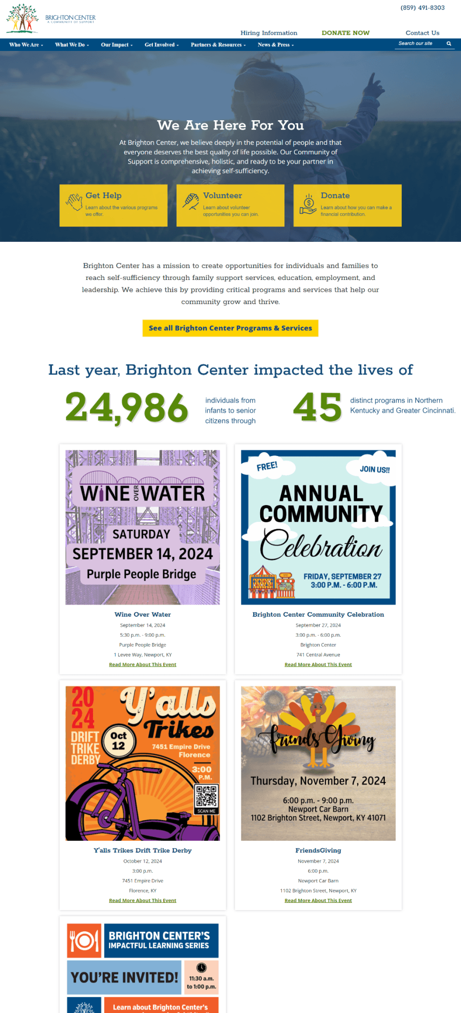
Brighton Center is a non-profit organization based in San Antonio that provides specialized services for children with disabilities and developmental delays.
This project involved the redesign of over 25 pages, with a clear objective: reduce friction, improve accessibility, and create an experience that supports users in high-stress situations.
The challenge was not just visual, but also structural.
context & challenge.
The platform served users who:
Are often emotionally and cognitively overloaded
Have limited time to navigate complex systems
Rely heavily on digital access for critical decisions
Despite this, the existing website introduced unnecessary complexity at every level.
Core contradiction:
A support-focused organization delivering a high-friction digital experience.
objectives.
USER GOALS
Quickly find relevant services
Understand complex information
Access content across devices
Feel supported and confident
BUSINESS GOALS
Improve service accessibility
Increase engagement with resources
Strengthen trust with families and partners
DESIGN GOALS
Reduce cognitive load
Improve information hierarchy
Ensure accessibility compliance (WCAG 2.1)
Create a scalable and consistent system
discovery phase.
RESEARCH & DISCOVERY
Site Audit — A full audit revealed systemic issues:
Inconsistent page structures
Lack of prioritization of key actions
Poor mobile performance
Heuristic Evaluation — Using usability principles, we identified:
Visibility of system status → weak
User control → limited
Consistency → broken across pages
Recognition vs recall → heavily recall-based
The experience relied too much on user effort.
RESEARCH & DISCOVERY
Site Audit — A full audit revealed systemic issues:
Deep navigation hierarchy (3–5 levels)
Inconsistent page structures
Lack of prioritization of key actions
Poor mobile performance
Heuristic Evaluation — Using usability principles, we identified:
Visibility of system status → weak
User control → limited
Consistency → broken across pages
Recognition vs recall → heavily recall-based
The experience relied too much on user effort.


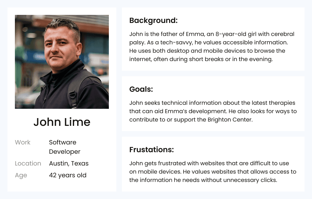
USER UNDERSTANDING
After a meeting with the client, we could define the persona based on pre-existing internal research and previously converted leads.
Maria → Needs simple navigation and clear language.
John → Values speed, structure, and mobile usability.
Emily → Needs fast access to shareable resources.


define phase.
INFORMATION ARCHITECTURE
We restructured the entire sitemap with:
Flattened hierarchy
Task-oriented grouping
Clear entry points from homepage
Before:
Organized by internal logic
After:
Organized by user intent
INFORMATION ARCHITECTURE
We restructured the entire sitemap with:
Flattened hierarchy
Task-oriented grouping
Clear entry points from homepage
Before:
Organized by internal logic
After:
Organized by user intent
INFORMATION ARCHITECTURE
We restructured the entire sitemap with:
Flattened hierarchy
Task-oriented grouping
Clear entry points from homepage
Before:
Organized by internal logic
After:
Organized by user intent

ideate phase.
SKETCHING DESIGN IDEAS
After analyzing the site architecture and identifying recurring information groups across legacy pages, we moved into low-fidelity sketching.
The goal was to define core page templates that consolidate primary content blocks while also concentrating the majority of reusable components.
The pages choosed to be on this low-fidelity sketch were:
Homepage
Services
Pediatric Therapy Services (0-3)
Blog homepage
Blog post page


ui phase.
CONVERTING INTO UI
We translated the sketches into low-fidelity prototypes to validate layout decisions and define reusable components for more efficient content organization. With that structure in place, we moved on to designing high-fidelity prototypes for the same five pages.
CONVERTING INTO UI
We translated the sketches into low-fidelity prototypes to validate layout decisions and define reusable components for more efficient content organization. With that structure in place, we moved on to designing high-fidelity prototypes for the same five pages.
CONVERTING INTO UI
We translated the sketches into low-fidelity prototypes to validate layout decisions and define reusable components for more efficient content organization. With that structure in place, we moved on to designing high-fidelity prototypes for the same five pages.


REPLICATING UI
After validating what worked and what didn’t, we refined the UI designs and component system, then scaled the solution across all 37 mapped pages and their variants, to ensure consistency
REPLICATING UI
After validating what worked and what didn’t, we refined the UI designs and component system, then scaled the solution across all 37 mapped pages and their variants, to ensure consistency
REPLICATING UI
After validating what worked and what didn’t, we refined the UI designs and component system, then scaled the solution across all 37 mapped pages and their variants, to ensure consistency
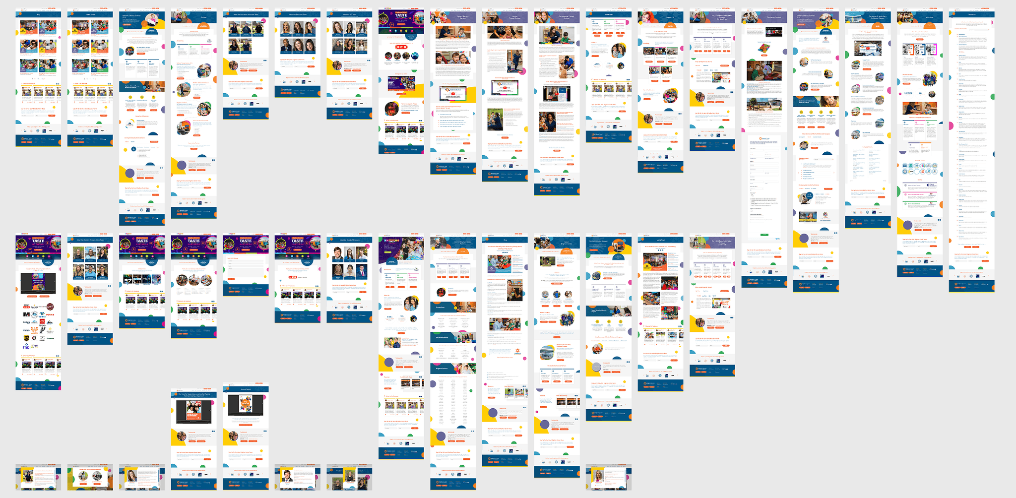
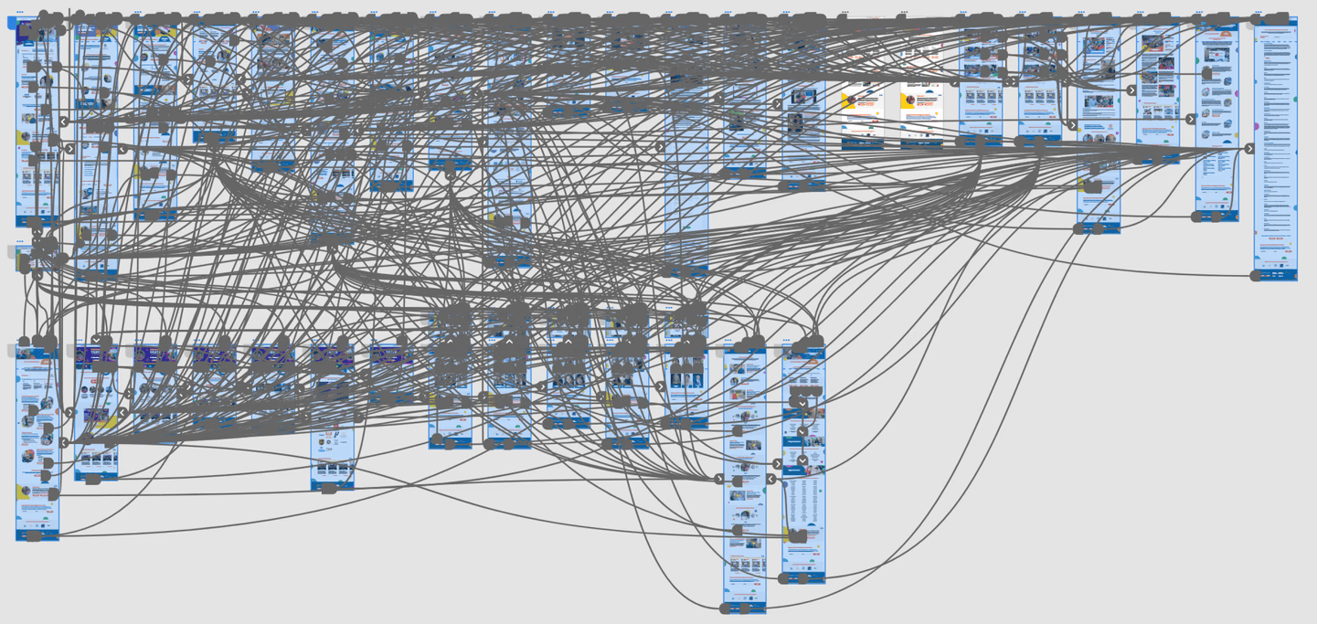
prototype phase.
VALIDATING 37 INTERCONNECTED PAGES
To validate the new information architecture and user flows, a full high-fidelity prototype was developed, covering 37 interconnected pages across the platform.
VALIDATING 37 INTERCONNECTED PAGES
To validate the new information architecture and user flows, a full high-fidelity prototype was developed, covering 37 interconnected pages across the platform.
VALIDATING 37 INTERCONNECTED PAGES
To validate the new information architecture and user flows, a full high-fidelity prototype was developed, covering 37 interconnected pages across the platform.


testimonial.
Bruno did a great job with the design comps for a large scale website. His attention to detail and willingness to put in the necessary time to make our deadline were excellent. He has great communication skills and our team found it easy to coordinate and work with him.
Bruno did a great job with the design comps for a large scale website. His attention to detail and willingness to put in the necessary time to make our deadline were excellent. He has great communication skills and our team found it easy to coordinate and work with him.
Bruno did a great job with the design comps for a large scale website. His attention to detail and willingness to put in the necessary time to make our deadline were excellent. He has great communication skills and our team found it easy to coordinate and work with him.
Michael Bound
Feedback via UpWork